Fini Cow
Packaging Design | Experimental Project
The Fini cow-shaped candy with dulce de leche flavor started as a joke and turned into an experiment. Someone suggested on our Instagram that we create a Fini candy with dulce de leche flavor, and we got really excited about the idea of developing it beyond the packaging: the shape, the fruit, and the little animal inside. Wait, dulce de leche and an animal: a cow-shaped marshmallow with dulce de leche flavor. And that was it, we had the product idea.
Some news reports helped me understand the production process, and that was essential in deciding the direction of the project. I also thought it was important to experience the sensory characteristics that this little cow would convey, since the product is edible. I needed to pick it up and feel if it made me want to bite and squeeze it like we do with a marshmallow.
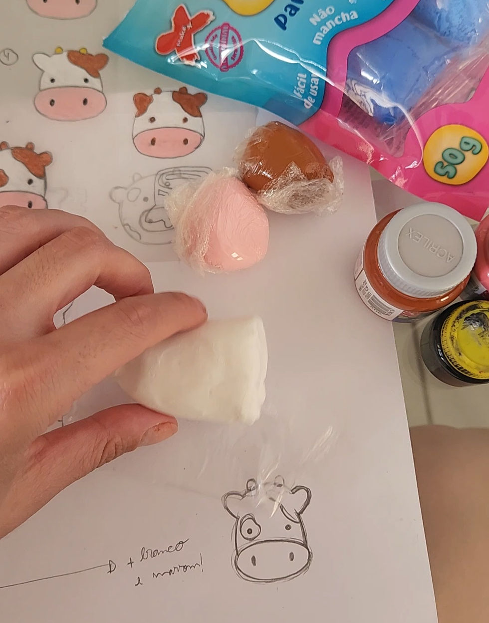
So I bought a strawberry marshmallow to help me understand the measurements, angles, and curves that the extruder could work with. What size would the spots and eyes have to be? I took the measurements and started shaping the little cow to the proportions and technically feasible dimensions. I chose EVA foam to make the prototype. It's light and matte, and its feel and weight are very similar to marshmallow.
Looking at the packaging, I noticed that Fini follows a fixed structure for its labels: tabs, title, flavor, display window, character, and weight information. This led me back to research and looking at Fini's product line. The structure of the Marshmallow, Flower, Heart, and Sweet Popcorn lines seemed the most interesting to follow. This would allow for thematic addition to the packaging, with spots replacing the stripes. Spots at the edges would help identify the cow and indicate the marshmallow flavor.
I understand that the packaging follows a fixed structure, but the typography doesn't. Each package has a typography that suits the design and theme. The round, cute lettering, with little horns and ears alluding to a cow, would match the character and the marshmallow.
Fini's packaging colors are always vibrant and eye-catching, which is why I initially chose a pink background for the label's base. However, when I designed it, I didn't think the cow-shaped marshmallows stood out. I did other tests, and the beige base offered the best composition. A brown tone could also work, but it would easily be confused with the caramel flavor.
The milkier tone, like the character on the packaging, highlighted both the cow and the marshmallows and triggered a memory of milk, thus better decoding the flavor and the proposed visual characteristics.
Client: Experimental Project
Year: 2024
The Fini cow-shaped candy with dulce de leche flavor started as a joke and turned into an experiment. Someone suggested on our Instagram that we create a Fini candy with dulce de leche flavor, and we got really excited about the idea of developing it beyond the packaging: the shape, the fruit, and the little animal inside. Wait, dulce de leche and an animal: a cow-shaped marshmallow with dulce de leche flavor. And that was it, we had the product idea.
Some news reports helped me understand the production process, and that was essential in deciding the direction of the project. I also thought it was important to experience the sensory characteristics that this little cow would convey, since the product is edible. I needed to pick it up and feel if it made me want to bite and squeeze it like we do with a marshmallow.
So I bought a strawberry marshmallow to help me understand the measurements, angles, and curves that the extruder could work with. What size would the spots and eyes have to be? I took the measurements and started shaping the little cow to the proportions and technically feasible dimensions. I chose EVA foam to make the prototype. It's light and matte, and its feel and weight are very similar to marshmallow.
Looking at the packaging, I noticed that Fini follows a fixed structure for its labels: tabs, title, flavor, display window, character, and weight information. This led me back to research and looking at Fini's product line. The structure of the Marshmallow, Flower, Heart, and Sweet Popcorn lines seemed the most interesting to follow. This would allow for thematic addition to the packaging, with spots replacing the stripes. Spots at the edges would help identify the cow and indicate the marshmallow flavor.
I understand that the packaging follows a fixed structure, but the typography doesn't. Each package has a typography that suits the design and theme. The round, cute lettering, with little horns and ears alluding to a cow, would match the character and the marshmallow.
Fini's packaging colors are always vibrant and eye-catching, which is why I initially chose a pink background for the label's base. However, when I designed it, I didn't think the cow-shaped marshmallows stood out. I did other tests, and the beige base offered the best composition. A brown tone could also work, but it would easily be confused with the caramel flavor.
The milkier tone, like the character on the packaging, highlighted both the cow and the marshmallows and triggered a memory of milk, thus better decoding the flavor and the proposed visual characteristics.