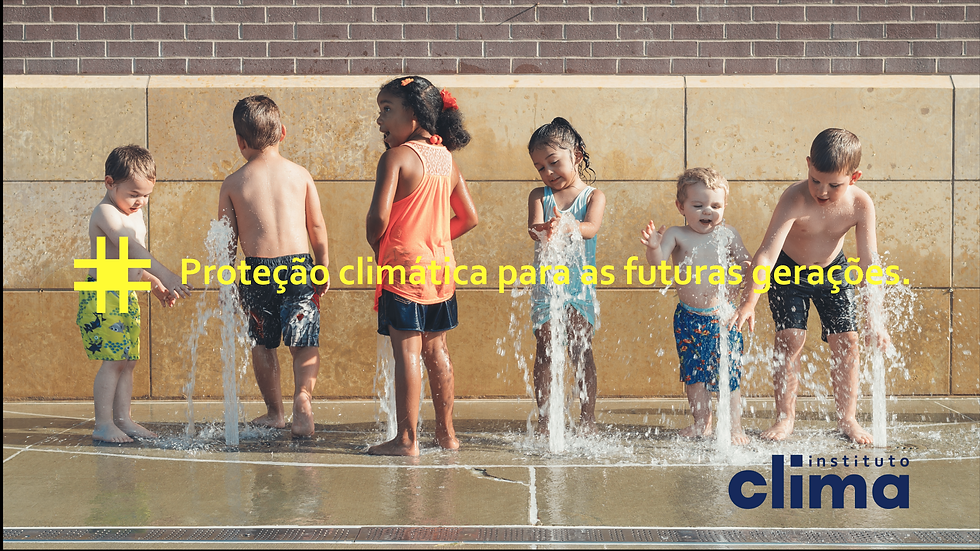
Climate Institute
Branding | Visual Identity | Pictogram | Website
The Climate Institute facilitates the development and implementation of actions aligned with the protection and balance of the climate system for educational institutions and companies. Far beyond simply considering the preservation of natural resources, the Climate Institute broadens the perception of the value of sustainability.
In this project, we need to show that climate protection is also a democratic, collective action, a transformative agent, and that it can be a business. The Institute works with different programs, always thinking about combining and connecting ideas. The comprehensive and contrasting color palette reflects this characteristic.
When we talk about nature and sustainability, we usually think of organic forms. However, the Climate Institute transforms climate initiatives into impact businesses. That's why we chose to work with square and rectangular shapes, to bring this practical sense to the brand's personality. This language was also carried over to the chosen typography; the dots on the "i"s and the periods are square. We also extended this graphic pattern to the pictograms that reveal the Institute's various activities.
Client: Institute Climate
Year: 2022
Climate Institute
Branding | Visual Identity | Pictogram | Website
The Climate Institute facilitates the development and implementation of actions aligned with the protection and balance of the climate system for educational institutions and companies. Far beyond simply considering the preservation of natural resources, the Climate Institute broadens the perception of the value of sustainability.
In this project, we need to show that climate protection is also a democratic, collective action, a transformative agent, and that it can be a business. The Institute works with different programs, always thinking about combining and connecting ideas. The comprehensive and contrasting color palette reflects this characteristic.
When we talk about nature and sustainability, we usually think of organic forms. However, the Climate Institute transforms climate initiatives into impact businesses. That's why we chose to work with square and rectangular shapes, to bring this practical sense to the brand's personality. This language was also carried over to the chosen typography; the dots on the "i"s and the periods are square. We also extended this graphic pattern to the pictograms that reveal the Institute's various activities.