Peruille
Rebranding | Packaging | Illustration
Peruille
Rebranding | Packaging | Illustration
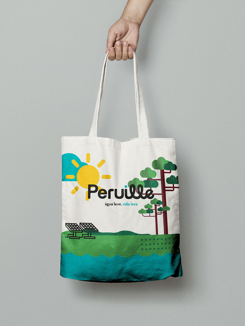
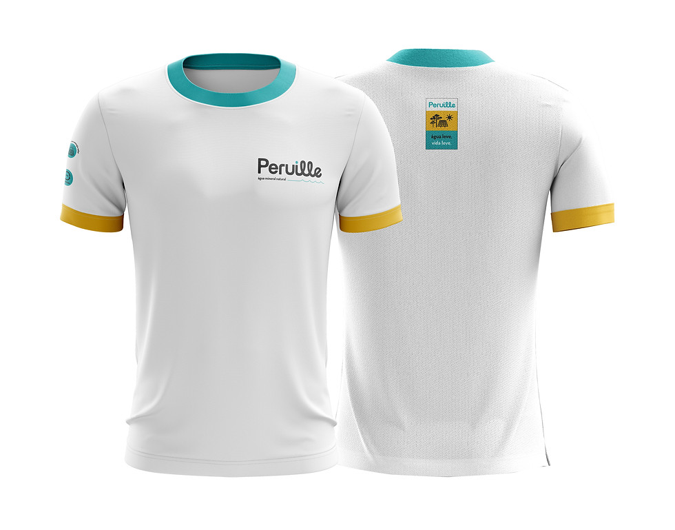
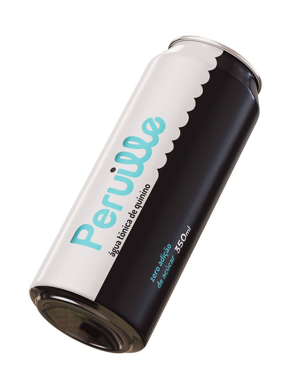
Peruille is a mineral water company from the interior of Paraná state, Brazil. The name is a combination of Peabiru, the city where it is located, and Uille, the family surname. The first logo was designed by the grandmother, and the jewel she wore on her chest featured the company's first logo in 2019. The name Peruille was kept, but a new positioning, without the drop iconography, was created for the brand. The stories of the grandparents and the city became the narrative, giving way to the creation of a concept more consistent with the company's current values. Concerned with building a path of sustainable growth and expansion, the new brand demonstrates the consolidation of what Peruille does best: local industry, nature, and sustainability.
Guimarães Rosa, in Grande Sertão Veredas, said that "near plenty of water, everything is happy." Showing the life that exists in water, and that also exists in Peruille, was the strategy employed in the new brand. In addition to rethinking the brand's positioning, we redesigned the company's entire family of labels: the 500ml mineral water packaging, with and without gas, the 200ml cup, the 1.5L, 5L and 10L water bottles, and the 20L returnable gallon.
Client: Peruille
Year: 2021
Peruille is a mineral water company from the interior of Paraná state, Brazil. The name is a combination of Peabiru, the city where it is located, and Uille, the family surname. The first logo was designed by the grandmother, and the jewel she wore on her chest featured the company's first logo in 2019. The name Peruille was kept, but a new positioning, without the drop iconography, was created for the brand. The stories of the grandparents and the city became the narrative, giving way to the creation of a concept more consistent with the company's current values. Concerned with building a path of sustainable growth and expansion, the new brand demonstrates the consolidation of what Peruille does best: local industry, nature, and sustainability.
Guimarães Rosa, in Grande Sertão Veredas, said that "near plenty of water, everything is happy." Showing the life that exists in water, and that also exists in Peruille, was the strategy employed in the new brand. In addition to rethinking the brand's positioning, we redesigned the company's entire family of labels: the 500ml mineral water packaging, with and without gas, the 200ml cup, the 1.5L, 5L and 10L water bottles, and the 20L returnable gallon.


_
Peruille is an invented word; it has no known meaning. The name is long and difficult to read, but it has a pleasant sound. And that was the focus of the redesign. By adjusting the thickness and spacing between the letters, the new logo is more visually comfortable and offers greater graphic engagement. The dot on the "i" was added to enhance the name's pleasant sound and make reading more fluid. The wavy lines of the cursive lettering allude to cursive water and reveal which segment the brand belongs to.